Stabilized
Steps Web App
GENERATIVE RESEARCH & STRATEGY, UX DESIGN
Overview
Stabilized Steps is a healthcare company that focuses on restoring independence and improving the lives of people with mobility and balance issues. The company is introducing the ‘Stabilife Program,’ a fall prevention exercise program that uses a ‘Stabilizer,’ a product released for GA (2018) as a practical alternative tool to walkers, and plans to release the ‘Stabilife System,’ a self-paced online video exercise platform created to improve strength, stability, and balance over time and reduce risk of falls for older adults.
For this project, my goal as a UX Research lead and UX designer was to use my experience in healthcare research and regulatory compliance to create an evidence-based and clinically approved MVP platform for the ’Stabilife’ Program where users can easily access their video workouts, complete health assessments, and track their progress over time.
Role
Research, Strategy, UX/UI Design
Timeline
April 2021 -present
Tools
Miro, UXPressia, Whimsical, Figma, Overflow, Zoom
Key Skills
Competitive evaluation, Concept testing, User interviews, Personas and empathy map, Brainstorming, Wire-framing, Design Critique, Prototype Creation, Usability Testing
Opportunity
Falls cause disability and fatal injuries in older adults
According to data released by the CDC, each year over 3 million elderly are treated in emergency departments for fall injuries and over 30,000 die from fall injuries. These numbers will increase as the global population of older adults grows and, according to a study published in the American Geriatrics Society, “medical costs due to falls will reach more than 50 billion dollars per year”, highlighting the need for fall prevention initiatives.
Balance and strength exercises prevent falls in older adults
Low levels of physical activity cause loss of muscle mass, strength, and endurance, and puts older adults at a greater risk for falls. Exercise interventions targeting strength and balance were proven effective preventing future falls when balance assessment and enrollment in an exercise program were recommended before any falls occurred. Early enrollment can prevent: reduced physical functioning from a fall injury, loss of independence, and emotional trauma due to fear of falls.
Digital platforms can make training programs more accessible
Most evidence-based exercise programs are delivered face-to-face but Apps and websites have the potential to provide a convenient, cost-effective, and accessible means for older adults to engage in strength and balance training. The use of technology is slowly increasing among older adults, thus designing a personalized and user-friendly digital exercise program can help them stay motivated to exercise and can increase adherence to the program.
My Proposed Process
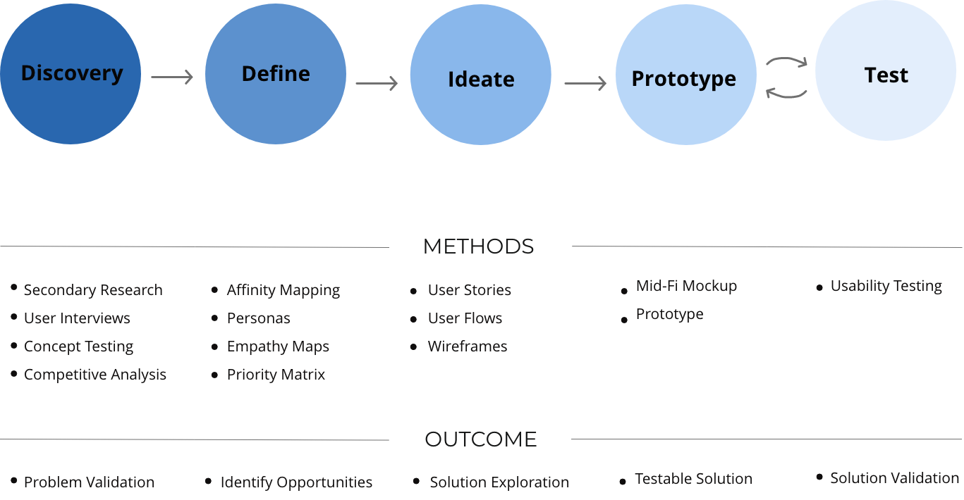
The UX design team and I proposed a design process for Stabilized Steps to match their current business goals. The following steps, methods, deliverables and timeline for the completion of our work had been discussed with founding members and approved before the start of the research and design process.
Understanding The Problem
The Stabilife exercise program was first launched in Thinkific, an online learning platform that allows users to create template-based virtual classes. The founding team saw the need to create a new, engaging, evidence-based, and well-regulated platform that can be accredited by the CDC for patient use. The Stabilized Steps’ leadership team was able to collect substantial business centric customer feedback through Thinkific but proper user research data was still missing, therefore, upon joining their team, my UX research approach was to:
Use secondary research to learn about the problem space and the CDC’s accreditation process to have our product recommended by healthcare providers.
Perform a competitive analysis to understand who are our main competitors and determine Stabilized Steps’ competitive advantage
Conduct user interviews to identify the programs’ target users, and to learn about their needs and pain points.
Conduct concept testing sessions to uncover pain points, frustrations, and barriers using the current online platform and identify baseline experience to guide MVP design.
1. The impact of accreditation in the design process
By completing the process of accreditation by the CDC we aim to make the Stabilife program easily accessible to patients and healthcare providers
My first approach to the problem was to understand the CDC’s process of accreditation and to integrate these steps to the above proposed design process. I used the CDC website and primary literature to guide my research. Adjusting our timelines and designs solutions to the accreditation process was no easy task but helped us:
Identify additional key players in the process and understand how they interact with our product and users (health care providers, nursing homes, caregivers, physical therapists, regulatory agencies, etc.)
Adjust design solutions to regulations to create a product whose effectiveness is backed by meaningful data.
Visualize a customer journey where a user (patient) may not follow traditional referral and purchasing processes to have access to this program so that we can adjust future approaches to these different touch points.
2. Discovering competitors
First, we evaluated direct competitors to verify the quality of the content we want to deliver.
Current digital interventions available to solve balance issues among the elderly population are difficult to find. I took it upon myself to do some extensive primary literature review to find programs similar to Stabilife. Upon finding some hidden gems, we were able to explore the content they deliver and we realized we were on the right track. The Apps that provide the most evidence-based content are: Otago, Nymble, Keep Up Keep On, and Standing Tall. Otago is the only platform based on an existing exercise program that was previously subjected to a randomized trial.
Then, we focused on finding competitors whose features, functions and interactions can inspire our redesign.
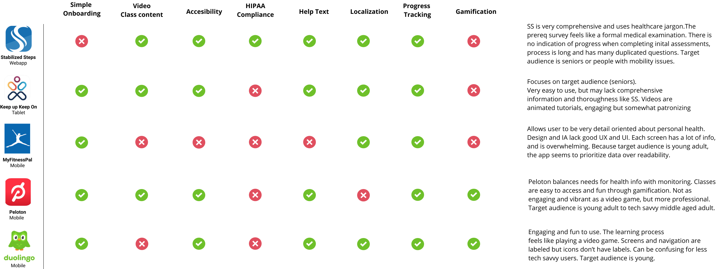
In terms of UX/UI design, I selected Keep On Keep Up (KoKu) to be the direct competitor to evaluate against Stabilife, as it also uses exercise videos to deliver content. The competitive analysis below evaluates Stabilife against MyFitnessPal, Peloton, and Duolingo. MyFitnessPal and Peloton were selected as indirect competitors due to their popularity among fitness apps, and Duolingo, an analogous competitor, was selected for being the gold standard of user-friendliness and gamification.
Competitive analysis table evaluates onboarding, video content, accessibility, HIPPA compliance, help text, location, progress tracking and gamification.
Creating this competitive analysis chart helped to identify:
Regulatory compliance and privacy as a strong competitive advantage over other services.
Onboarding as a strong friction point that may deter users to start using the app.
Need for gamification to engage users and keep them excited to workout.
3. Who are Stabilife users?
Conducting user interviews helped us identify Stabilife’s target users, their goals, needs, and the current pain points they experience when trying to improve their balance.
We recruited 9 participants whose balance issues ranged from some difficulty to severe balance impairment, focusing mostly on elderly users (65 years or older). Some participants used Stabilife before this session and some were exposed to the product for the very first time. Each participant went through a 40-minute user interview session via Zoom video call. Interviews were digitally recorded with consent and supplemented with field notes.
During each interview I had open-ended informal chats where users walked me through:
How they felt about their balance
How their balance issues are affecting their day to day activities
We also discussed if they use any tools, products or services to improve these issues.
Post-it notes containing relevant information from individual user interviews.
Post-it notes were grouped into clusters in order to define trends and collect insightful data that is relevant to our design process.
Upon completing the interview sessions, I conducted a remote workshop with the UX design team to create an affinity map where we organized the data collected. First, we wrote down all the relevant data from the interviews into post-it notes and we grouped the notes in clusters to identify insights more easily.
The main takeaways we identified from this process are:
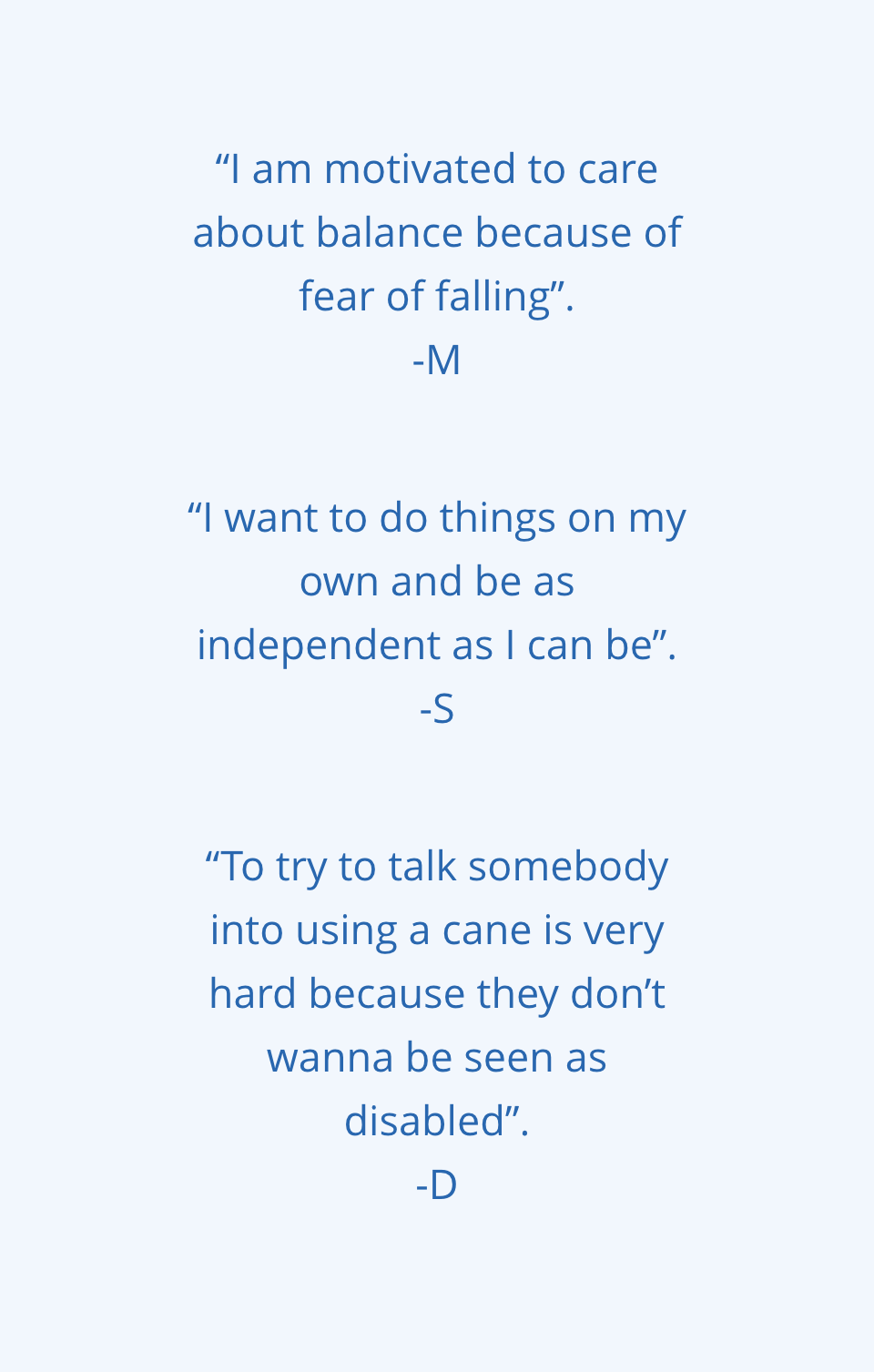
Behavior. Balance issues bring up fear of injuries caused by falls in elderly adults and make them feel a sense of loss of independence and vulnerability. We need to change the narrative and focus on encouraging prevention of balance issues as a means to increase independence.
Co-morbidities. In addition to Balance issues, the elderly may experience medical issues that can impair their movement or ability to exercise, highlighting the need to for flexibility of content.
Technology. Elderly users are not comfortable using technology, as opposed to younger generations. Thus far the products they’ve used failed to adjust to their level of technology literacy.
Creating personas to communicate user goals, needs and pain points.
In order to communicate our findings with diverse teams, the UX designers and I created 3 user personas based on the severity of balance issues to represent our range of users. We also made an effort to highlight the persona’s attributes, goals, motivations, and frustrations to make sure other teams can empathize with an age group most people are not familiar with designing for.
4. What are the pain points Stabilife users experience?
Performing concept tests helped us identify the problems users experience with Stabilife vs main competitor.
We recruited the same 9 participants who were previously interviewed, mostly elderly users (65 years or older). Each participant went through a 20-minute concept testing session via Zoom video call. The goal for this session was to compare Stabilife’s exercise program against KuKo, our direct competitor, and to obtain specific feedback about:
Sign-up process and introduction to the product,
Onboarding process,
Home page and the first class (Day 1) of the exercise program
Test sessions were digitally recorded with consent and supplemented with field notes.
For each test, each participant was asked to provide their thoughts about:
Product content, images, illustrations, etc.
What they liked and disliked about both products and how they would improve them
What product they would trust more and recommend to others.
Relevant notes from individual concept tests were collected into post-its.
Post-it notes were grouped into clusters to collect feedback about Stabilife and Kuko.
Upon completing the testing sessions, we organized the data with an affinity map to generate insights.
The main positive feedback we collected about Stabilife is that:
Real people videos are more engaging. Users can relate with the instructor and understand instructions better than with illustrated videos.
Users want to choose exercise movements that best match their needs. Having the flexibility to modify an exercise routine allows users to not feel left out despite any physical impairment they may have.
Safety builds confidence. Safety guidelines make users feel safe and add credibility to the exercise program.
And the improvements should focus on:
Redesign platform for accessibility. Text needs to be shortened and more images need to be added to make the platform simple and concise.
Medical jargon intimidates users. Changing the tone of communication and simplifying the content can make the platform more engaging and fun.
Simplify the onboarding process to increase retention. Lengthy health questionnaires and physical assessments add credibility to Stabilife but can also discourage users from using the platform.
Exploring Solutions
Defining the problem and introducing design constrains prior to brainstorming solutions to create goal-oriented designs.
The design team and I created “How-Might-We (HMW)” questions that can help us frame the ideation process of the new Stabilife program’s MVP. Then, we defined three constrains that we included to shape our design:
Meet the needs of a Power user first (commercial)
Prioritize features based on research data (requirements)
An Adaptive Mobile App design approach that works with a no-code platform (integration)
The Power user selection allowed us to narrow our focus and prioritize solutions for the user who will benefit the most with the new platform. We mapped the most important red routes that Judith, our power user, will most likely follow as a first time or returning user.
Next, I created a prioritization matrix to synthesize the research data we collected and as result:
Selected the users’ insights that best guide our design process, and
Communicated the priority of features to the leadership and design teams.
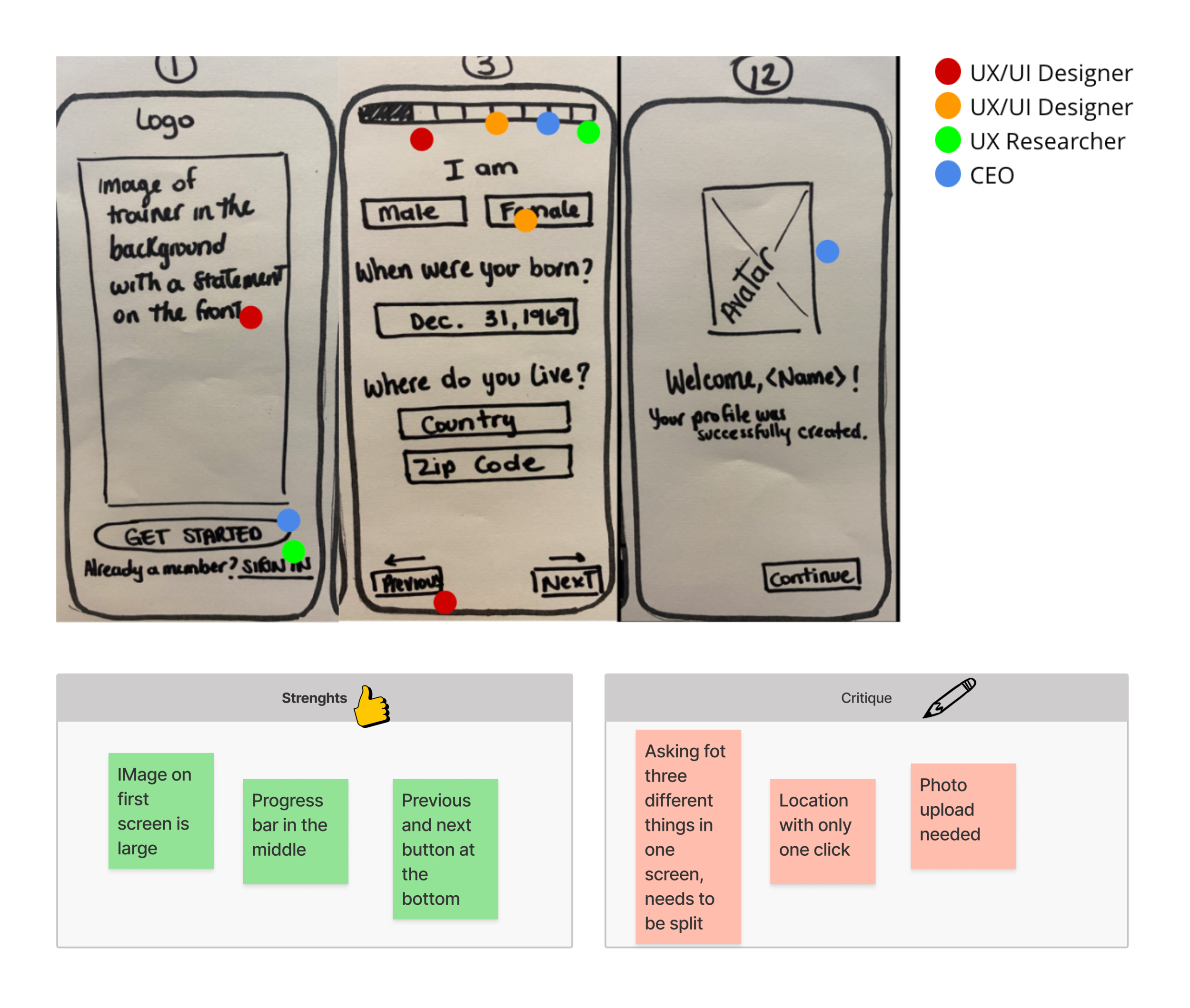
I co-facilitated a 2.5-hour brainstorming session with 4 participants, including the CEO and the design team to design: the onboarding, main/home page, and video activity page. We included a lightning demo exercise, a three-panel solution sketching session, and a design critique session using a dot voting system. The goal was to design mobile screens first, to focus on the smallest of screens and the core functions of the product so we can move on to bigger screens later.
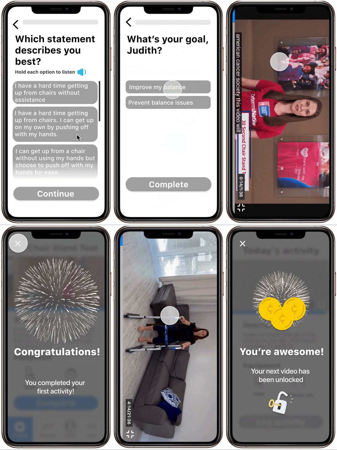
The design team and I quickly put together mid-fidelity wireframes to communicate structure, content, and functionality of the results from the brainstorming session.
Six main hero screens of the user flow. (L to R) Onboarding, main screen, and video play.
Early testing of product prototype to get feedback from users and validate the initial idea.
We wanted to get some feedback about the design solution as quickly as possible so we put together a simple prototype for a guerrilla usability testing session. We recruited 5 random participants (18 years or older) from our personal network and each participant went through a 30-minute testing session via Zoom video call. We took notes and we recorded the session via screen share.
The goals for these sessions were to:
To test the UI of the product in a mobile device
Accessibility
Icon and button recognition and proper use
Main Navigation
To uncover usability problems when
Signing up for Stabilized Steps
Locating and completing balance assessment
Locating and completing the daily activity
Upon completing the tests, the UX design team and I organized the data in an affinity map. Then we collected the most relevant feedback and presented the three main takeaways to stakeholders along with re-design recommendations.
Findings
Navigation: Most users were unable to exit full-screen mode using the “minimize” button.
Content and UI: Unclear meaning of “Complete” button on the activity page. Users were not sure to press it to start or to finish the class.
Accessibility: “see all'‘ button was too small and often missed by users. Onboarding font-size is also difficult to see.
Recommendations
Navigation: Substitute minimize button for a top-left “X” button to exit full screen.
Content and UI: Substitute the “Complete” button for “End class” button.
Accessibility: Resize font to size 16 at a minimum and reduce the visual load by adding more space between lines and paragraphs.
Next Steps
Having completed the generative research process, Stabilife is entering the testing and revision phase which will include:
UX Research: Complete additional User flows that meet all red routes for power user integrating the feedback collected from the guerrilla usability test. Follow up with recurring testing.
UX Design: Complete High fidelity prototype for the additional red routes, and design desktop and tablet screens in addition to mobile screens.
UI design: Create a style guide and illustrations
This is an ongoing project and I will update the final product when available. Stay tuned!
Final Thoughts
Challenges
1. Advocating for a User-Centered Design Process.
Needed to educate founding members about User-Centered Design and the value of UX Research with a kick-off meeting and plan proposal presentation.
2. Fully remote communication and data capture
Fully remote and online project.
Training and proficiency in the use of online collaboration tools were needed.
Weekly debriefs were used as a communication tool to get feedback and demonstrate progress.
3. Elderly technology literacy impacted UX Research
Recruiting required a lot of communication via email, text, and calls.
New technology like videoconferencing is more difficult to learn for the elderly
Privacy concerns when it comes to sharing data online
Thanks for your attention!
Wins
1. Buy-in from stakeholders and development team
The business model was modified so founding members can focus resources on collecting user data before focusing on UI and development.
2. Taking a product from 0 to 1
By joining the team at the start of the research process, I took a lead role to generate primary qualitative data.
Created the first research plan that was executed according to the proposed timeline.
3. Meeting the overlooked needs of the elderly
Empathizing and learning about elderly needs shaped our product redesign.
Design-wise we focus on accessibility and delivering validated content.


